
“What colour should my gaming lights be?” is one of the most asked questions in every gaming community — and one of the worst answered. Most advice stops at “go purple”. This guide gives you the full reasoning: which colour suits which game, which mood, and which hour of the day.
One distinction before we start: bias lighting behind your screen should always be neutral white (6500K). Everything in this guide is about accent and ambient lighting — the glow on walls, under desks and in coves.
Table of Contents
- 1. The Single-Colour Reference Table
- 2. Blue and Cyan: Alertness for Competitive Play
- 3. Red and Deep Amber: Horror and Late-Night Intensity
- 4. Purple: The Most Forgiving Single Colour
- 5. Green: Easier on the Eyes Than You Expect
- 6. Warm White and 6500K: The Non-Decorative Choices
- 7. After Sunset: Colour Timing and Sleep
- 8. Frequently Asked Questions
1. The Single-Colour Reference Table
Bookmark this table — it is the whole guide in one screen:
| Colour | Why it works | Best for | Watch out for |
|---|---|---|---|
| Cyan / cool blue | Cool tones increase alertness and pair with a monitor\u2019s native white point | Competitive shooters, MOBAs, daytime sessions | Strong blue after sunset works against sleep |
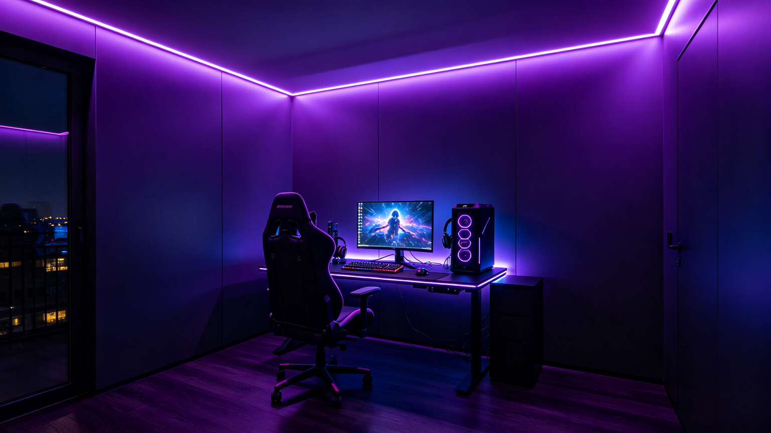
| Purple / indigo | Calm and energetic at once — rarely looks wrong, high perceived value | All-rounders, RPGs, strategy, general ambience | Deep purple crushes to near-black on cheap strips |
| Deep red | High energy, minimal effect on melatonin — the best late-night hue | Horror, intense single-player, midnight sessions | Red reduces colour perception; never as bias light |
| Green / emerald | Perceived as soothing, easier on the eye than equal blue | Long calm sessions, open-world and exploration | Can read as “gaming chair” green if oversaturated |
| Amber / warm white | Lowest impact on circadian rhythm, correct after sunset | Wind-down sessions, mixed work-and-game desks | Too warm reads as a bedroom lamp — layer it |
| Neutral white 6500K | The correct bias-lighting spec — on-screen colour stays accurate | Monitor and TV backlighting. Non-negotiable | Many “white” strips drift warm or green |
2. Blue and Cyan: Alertness for Competitive Play
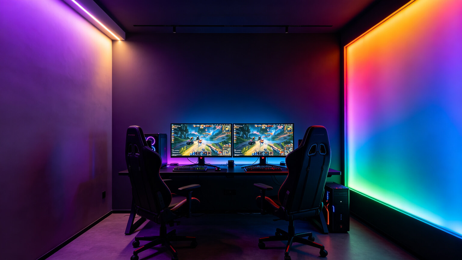
Cool tones measurably increase alertness, which is why cyan works for competitive shooters, MOBAs and daytime sessions. It also sits naturally next to a monitor\u2019s native white point, so the room and screen feel like one system.
The catch: blue light suppresses melatonin, so a bright cyan room at midnight works against your sleep. Keep cyan for the day, and switch to warm tones after sunset.
3. Red and Deep Amber: Horror and Late-Night Intensity
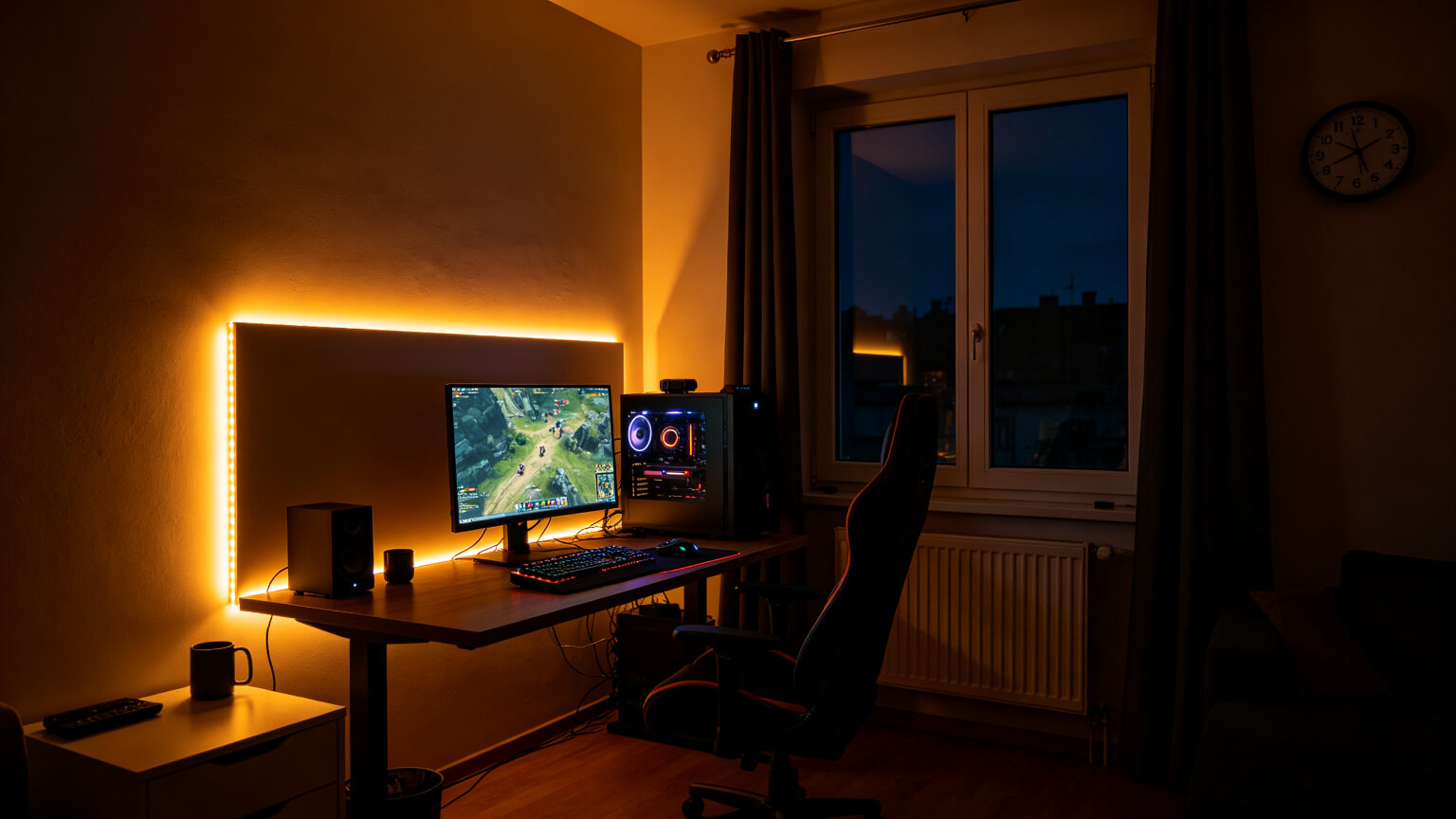
Deep red is the highest-energy hue in the spectrum and has the minimal effect on melatonin of any colour — which makes it the best late-night choice for atmosphere. It is the natural companion to horror and intense single-player titles.
Two warnings. First, red reduces colour perception elsewhere in the room — fine for immersion, bad for checking notes. Second, never use red (or any colour) as bias lighting behind the screen; it distorts on-screen colour.
4. Purple: The Most Forgiving Single Colour
Still debating one colour vs rainbow? The single-colour vs RGB comparison makes the case with side-by-side reasoning.
Purple is the community default for good reason. It sits between blue\u2019s alertness and red\u2019s warmth, reads as both calm and energetic, and rarely clashes with furniture or other gear. In interior terms it has high perceived value — a purple-lit room photographs “designed” rather than “decorated”.One practical note: deep indigo can crush into near-black on cheap strips at low brightness. If purple looks grey, the strip\u2019s colour rendering is weak — a CRI 90+ strip keeps purple true.
5. Green: Easier on the Eyes Than You Expect
Green is perceived as soothing and is easier on the eye than an equivalent brightness of blue — the eye is most sensitive to green, so it needs less output to look equally visible. That makes it a strong choice for long, calm sessions, open-world and exploration games.
The risk is cultural: oversaturated green reads as “gaming chair” green. The fix is simple — go deeper and dimmer. A deep emerald at 30% brightness looks premium; a neon green at 100% does not.
6. Warm White and 6500K: The Non-Decorative Choices
For the full room plan this colour system runs on, see how to light a gaming room, and for small bedrooms and rented flats, rental-friendly gaming lighting.
Two “white” options deserve a category of their own because they are not decoration — they are function.Neutral White
The only correct bias lighting. Behind your monitor or TV, use 6500K neutral — never colour.
Warm White
The lowest-impact tone for circadian rhythm. Use it in the two hours before bed.
Tunable White
A tunable-white strip covers both — bright neutral by day, warm by night, from one product.
If your room mixes a 6500K bias light with a 3000K accent light, that is intentional and fine — just keep each in its role. The mistake is mixing within one role. Our colour temperature guide explains temperature mixing in detail.
7. After Sunset: Colour Timing and Sleep
If you game after sunset — and most of us do — the science is simple: blue-rich light suppresses melatonin, the hormone that tells your body it is time to sleep. Warm amber light barely affects it; deep red sits at the bottom of the suppression chart. Your gaming room does not have to fight your sleep schedule.
Cool = Day
Keep bright cyan or cool white for daytime sessions and competitive play before sunset.
Warm = Night
From about two hours before bed, switch ambient and accent light to warm amber (2700–3000K).
Deep Red for Atmosphere
For horror and intense late-night sessions, deep red is the most sleep-neutral accent colour.
Bias Stays White
Bias lighting behind the screen stays neutral 6500K for colour accuracy — dim it, but do not colour it.
The best setups do not rely on you remembering to change the lights. They use a saved “sunset” profile:
- Set a trigger: a smart schedule at your chosen sunset time, or a scene button on the remote.
- Drop the colour temperature: ambient to 2700–3000K warm.
- Drop the brightness: ambient to ~30%, accent to its lowest usable level.
- Keep bias white: dim the 6500K backlight, do not change its colour.
- Make it one button: a single “sunset” scene that does all of the above.
An example schedule that works with a typical 12 AM bedtime:
| Time | Lighting state | Why |
| 6 PM – 8 PM | Normal session mode | Cool-ish ambient at 40%, accent on, bias at 10% |
| 8 PM – 10 PM | Warm transition | Ambient drops to 3000K, brightness to 30% |
| 10 PM – 12 AM | Sunset mode | Warm 2700K at low brightness, accent off or deep red |
| After session | Wind-down light | One warm lamp on, screens off — 20–30 minutes before bed |
One honest note: blue-light filters do not reduce eye strain — the evidence for “blue-blocking saves your eyes” is weak. What warm lighting does affect is sleep timing. Use it for the right reason: not to save your eyes, but to help you wind down. The right hardware — a tunable-white strip (2700–6500K) with a dimmable driver — covers day and night from one product.
8. Frequently Asked Questions
▶What colour light is best for gaming?
For general ambience, purple is the safest all-round default. Cyan suits competitive daytime play, deep red suits horror and late-night atmosphere, and warm white is best after sunset. Bias lighting behind the screen should always be neutral 6500K white.
▶What colour is best for gaming at night?
Deep red or deep amber, because they have the least effect on melatonin. Keep the brightness low and avoid bright cyan or blue after sunset.
▶Is purple good for a gaming room?
Yes — it is the most forgiving single colour. It reads calm and energetic at once, works with most decor, and looks expensive when the strip quality is good.
▶Does the colour of my lights affect my sleep?
Blue-rich light suppresses melatonin, the sleep hormone. Warm amber and deep red have the least impact, which is why switching to warm tones after sunset helps.
▶Can I use different colours in different parts of the room?
Yes — but assign roles: one accent colour for the room\u2019s ambience, and a separate neutral white for bias lighting behind the screen. Two accents that fight each other read as clutter.
Need a Strip That Can Do Your Colour, Properly?
Share your room size and the colours you want — we will recommend the right CRI, density and dimming package, factory-direct with free samples.
Contact KayTai
Colour choice really changes the mood of a room. The suggestions for matching light to game genre make sense, and the warning about harsh colours during long play is a thoughtful detail most guides skip.
Nice practical guide on gaming light colors. The suggestions for different moods and game genres are easy to follow, and the section on avoiding harsh colors during long sessions is a thoughtful touch.
I had been using red bias light for late-night sessions and the section on colour temperature vs mood made me switch to a dimmer warm white. The suggestion to avoid saturated blues before sleep is one I will actually follow. Practical guide, thank you.