
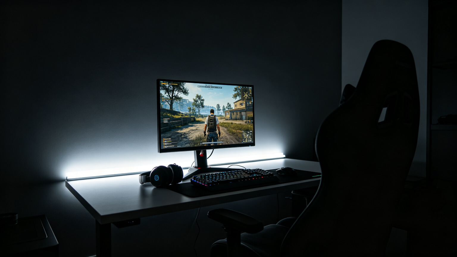
Ask most gamers what bias lighting should be and they will describe an RGB strip behind the monitor. That is the single most common mistake in gaming lighting — because the correct answer is the opposite of colourful. It is neutral white, around 6500K.
This guide explains what bias lighting actually does to your eyes, why colour is wrong behind a display, and how to calibrate it in two minutes.
Table of Contents
1. What Bias Lighting Actually Does to Eye Strain
The same principles scale up to a living room — see lighting a console gaming setup for TVs, and the gaming colour guide for what changes after sunset.
In a dark room, your screen is the brightest surface you can see — often far brighter than the wall behind it. Your pupils adjust to the average of what you look at, so when the surrounding wall is black, your pupils stay wide and the bright screen hits them hard. That mismatch is a real, documented contributor to eye fatigue during long sessions.Bias lighting fixes the mismatch by putting a controlled glow behind the display, so the area around the screen is no longer a black hole. Eye-health guidance generally recommends that the wall behind a screen should not be more than about 3× brighter or darker than the screen. In a dark gaming room the real ratio is often 10:1 or worse — and that is exactly the setup most gamers are running.

2. The 6500K Rule: Why Neutral White — Not Colour
Bias lighting is the one place in a gaming room where colour is the wrong answer. The reasoning is not aesthetic — it is perceptual:
Your brain judges what is on screen relative to what surrounds it. A red, blue or purple glow behind the monitor shifts your colour perception of the display, and the effect is strongest in dark scenes where accuracy matters most. Neutral white does not shift anything — it simply makes the surroundings match the screen\u2019s native white point.
Neutral 6500K
Matches the white point of most monitors — nothing added, nothing distorted.
Low Brightness
Roughly 10% of screen brightness is plenty; bias light is a whisper, not a statement.
No Saturation
Any saturated hue behind a display changes how you read on-screen colour. Keep it white.
Honest Specs
Many “white” strips drift warm or green — check the colour temperature rating.
Brightness discipline is the other half of the equation — our gaming room lighting too bright guide explains the 30–40% rule and how to calibrate the whole room.
Bias-lighting category data shows this is a real commercial category too: gaming-focused bias strips account for about 26.8% of unit sales and sell at a 34.2% higher average price than general-purpose strips — but most of them are still sold as RGB toys. Buying a strip that can do 6500K neutral is the upgrade that actually matters.3. Neutral White vs RGB: How Each Changes What You See
Here is the side-by-side you will not find in most product listings:
| Behind the screen | What happens to on-screen colour | Eye fatigue over 4+ hours | When to use it |
|---|---|---|---|
| Neutral white 6500K | Colours stay accurate; contrast perception improves | Noticeably lower | Always — it is the correct bias light |
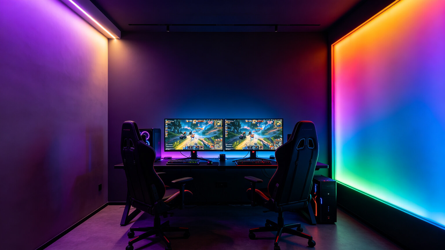
| Static colour (e.g. purple) | Slight shift; worst in dark scenes | Similar to no light | Accent, not bias — move it away from the screen |
| Cycling RGB | Constant shifting perception | Highest distraction load | Streaming background only, never behind the display |
The practical rule in one sentence: bias light is white, accent light is coloured. Mixing them up is the most common setup error we see.
4. How Bright Should Backlighting Be?
Two useful reference points:
The 3× Rule
The wall behind the screen should not be more than 3× brighter or darker than the screen. This is the contrast limit eye-care guidance recommends.
The 10% Rule for Bias
For backlighting specifically, roughly 10% of your screen\u2019s peak white is enough. If the glow visibly competes with the screen, it is too bright.
Test in a Dark Scene
Load a dark game scene, then dim the backlight until it is just visible at the edge of your vision.
Use a Dimmable Driver
You cannot hit 10% without smooth dimming. Cheap controllers often skip too fast or flicker at low levels.
Brightness discipline matters for every light in the room — not just bias light. Our guide to matching room brightness to your monitor breaks down the full calibration method.
5. How to Set It Up Correctly
- Choose 6500K neutral white — a tunable-white strip set to 6500K works perfectly.
- Mount behind the monitor\u2019s top and side edges, facing the wall, so light wraps around the display.
- Use a diffuser or channel to kill LED dots — dots behind a screen are distracting.
- Dim to ~10% of screen brightness using a dimmable driver.
- Match one temperature if you also run accent lighting elsewhere in the room.

Strip specifications — density, voltage and mounting — are covered in our complete LED strip guide.
6. Frequently Asked Questions
▶Should bias lighting be RGB?
No. Behind a display, saturated colour distorts your perception of on-screen colour. Bias lighting should be neutral white around 6500K. Keep RGB for accent lighting away from the screen.
▶What colour temperature is best for monitor backlighting?
6500K, matching the standard white point of most monitors. Avoid strips that drift warm (3000K) or green — check the rated colour temperature before buying.
▶How bright should bias lighting be?
Around 10% of your screen\u2019s peak white level — just enough to soften the contrast between screen and wall, never enough to compete with the display.
▶Can I use a regular RGB strip set to white?
Usually poorly. RGB strips mix red, green and blue to fake white, which often looks pink or green and is not a true 6500K. Use a dedicated white or tunable-white strip instead.
▶Does bias lighting reduce eye strain?
It reduces the strain caused by extreme screen-to-wall contrast, which is one of the most common contributors during long sessions. It is not a cure for eye fatigue — regular breaks still matter.
Get the Right 6500K Strip for Your Monitor
Tell us your monitor size and we will recommend the correct length, density and dimmable driver — factory-direct pricing with free samples.
Contact KayTai
Bias lighting is underrated for eye comfort. The 6500K recommendation behind the monitor works well for reducing perceived contrast. The placement diagrams make it easy to replicate.
Excellent explanation of bias lighting. I added a 6500K strip behind my monitor and the difference in perceived contrast is real. The section on placement and brightness ratio is genuinely useful.
This is the article I wish I had found six months ago. The explanation of why a dimmable warm-white bias light reduces eye strain during long gaming sessions is spot on. The brightness ratio recommendation matched what finally worked for me after trial and error.