
Most gaming rooms are lit backwards: the first thing bought is the glowing accent light, and everything else is an afterthought. Professionals think the opposite way. A room is built in three layers — ambient, task and accent — and getting the order right is what separates a setup that looks designed from one that looks decorated.
Here is the framework, layer by layer, with brightness targets you can apply tonight.
Table of Contents
- 1. Layer 1 — Ambient: Killing the Cave Effect
- 2. Layer 2 — Task: Lighting the Keyboard Zone Without Glare
- 3. Layer 3 — Accent: Where Single Colour Actually Belongs
- 4. Single Colour vs RGB: Why One Hue Beats the Rainbow
- 5. The 30–40% Brightness Rule
- 6. Why Accent Is the Last Priority, Not the First
- 7. A Room Built in Three Layers
- 8. Frequently Asked Questions
1. Layer 1 — Ambient: Killing the Cave Effect
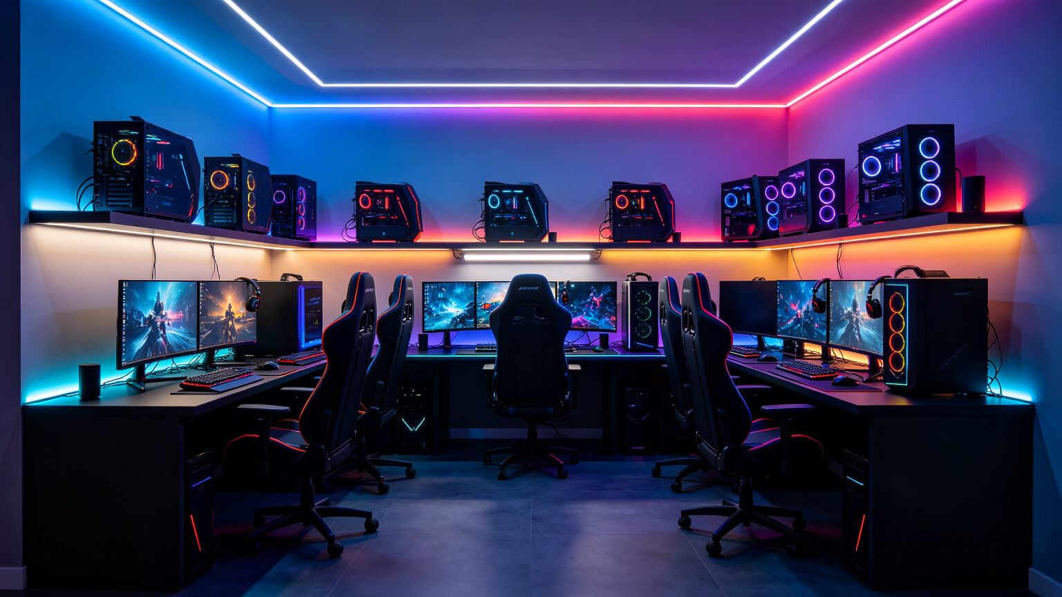
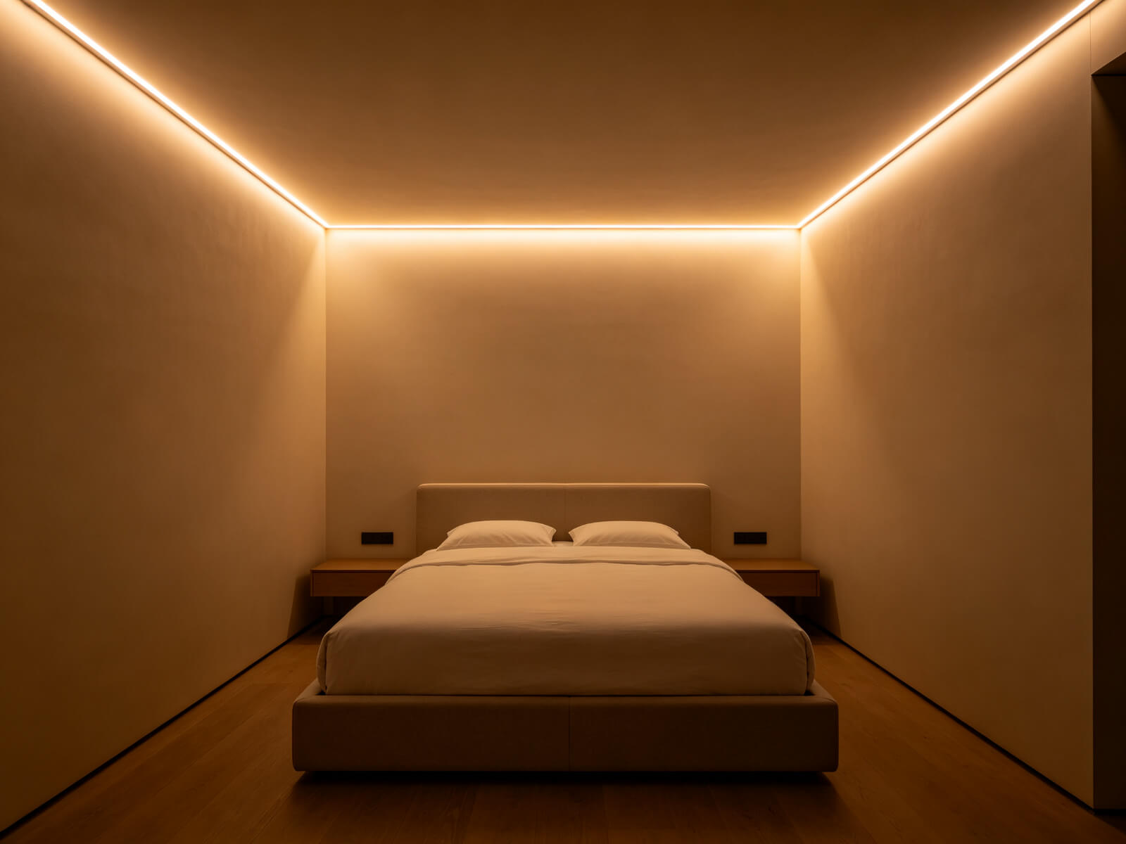
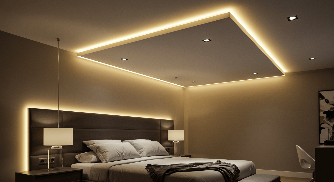
Ambient light is the base layer: the even glow that fills the room so it does not feel like a cave with a screen in it. In a gaming room this usually means soft light on the ceiling or upper walls — a cove, a ceiling run, or an uplight behind furniture.
The target: ambient light should sit at roughly 30–40% of your monitor peak white — enough that the room has presence, never enough to compete with the screen.
2. Layer 2 — Task: Lighting the Keyboard Zone Without Glare
Task light is for seeing what you are doing: your keyboard, controller, notes or paperwork. It should be brighter than ambient but aimed so it never hits your eyes or reflects off the screen.
Good options: a small desk lamp with a shielded head, a linear profile mounted under a shelf above the desk, or a strip under the monitor stand facing forward. The rule is placement — the light source must be above or behind your hands, out of the line of sight.
Bright but Local
Task zones can run 50–80% of screen brightness, but only over a small area.
Never in the Eyes
Shielded or angled light only — direct glare destroys dark adaptation.
No Screen Reflection
Test from your seated position: if you can see the lamp in the screen, move it.
Independent Switch
Task light must be controllable separately from ambient and accent.
3. Layer 3 — Accent: Where Single Colour Actually Belongs
The one-colour-vs-rainbow debate plays out almost entirely in this layer — see the single-colour vs RGB argument for our take.
Accent light is the emotional layer — the coloured glow on walls, behind shelves, under the desk. This is where single-colour lighting belongs, and it is the layer most people start with by mistake.Accent should be dimmable and low — it is a mood, not a statement. One hue, well placed, reads as intentional. Cycling gradients at this layer read as noise.
One Hue per Room
One accent colour keeps the hierarchy clean; two fighting accents read as clutter.
Hidden Sources
Behind desks, under shelves, in coves — you should see the glow, not the strip.
Dim by Default
Accent sits below ambient brightness — save a low preset and use it.
Not Behind the Screen
Bias light behind the display is a different job — neutral white, never accent colour.
For the full colour guide with game-by-game recommendations, see our gaming colour guide.
4. Single Colour vs RGB: Why One Hue Beats the Rainbow
Most gaming rooms are lit backwards in another sense too: rainbow gradients cycling behind the desk were the default for years, yet the setups that get called “clean”, “premium” or “adult” almost never look like that. Category research shows roughly 71.2% of LED strip buyers name aesthetic enhancement as their main reason to buy — and rainbow delivers that instantly. The problem is what happens after week one: the same gradient that impressed in a photo starts to feel like noise in the corner of your eye.
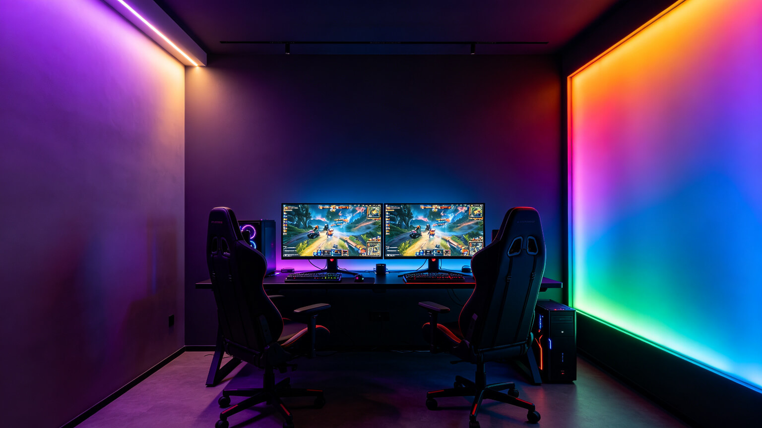
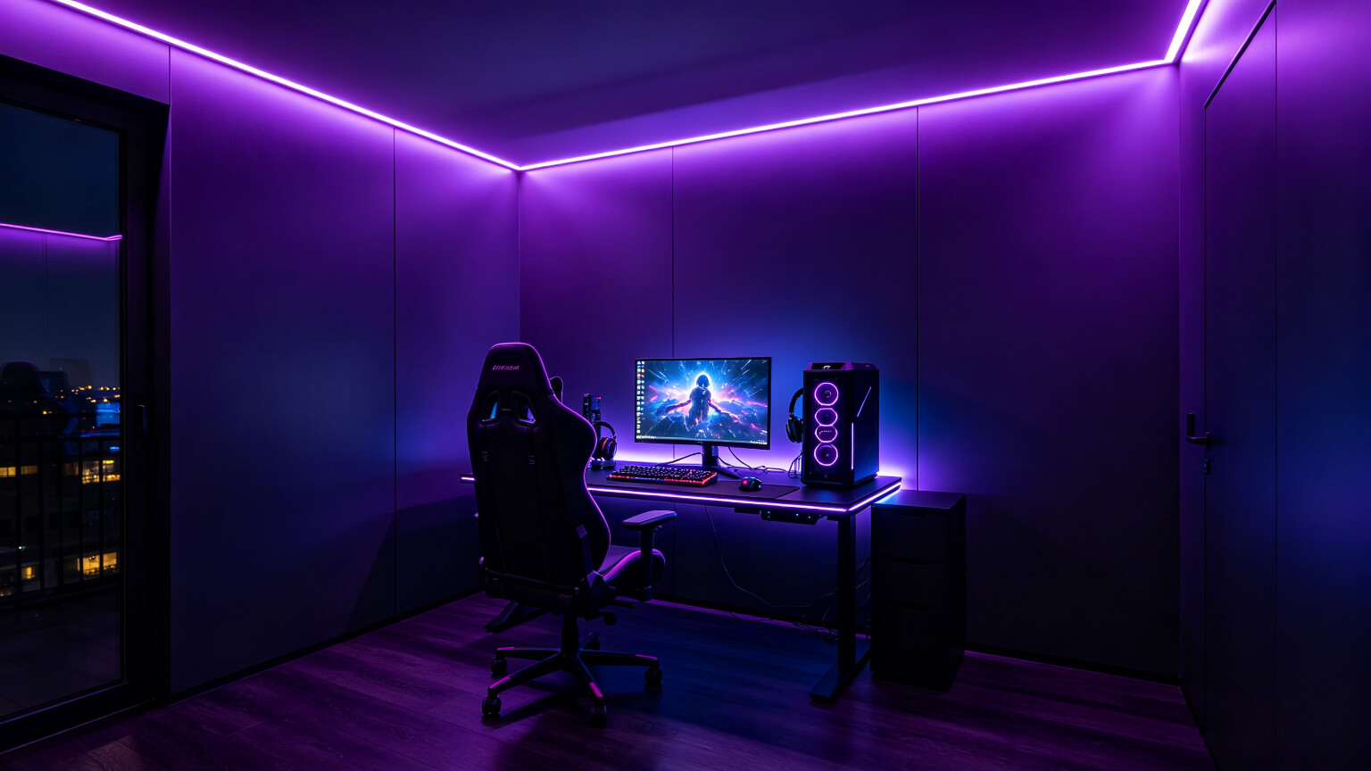
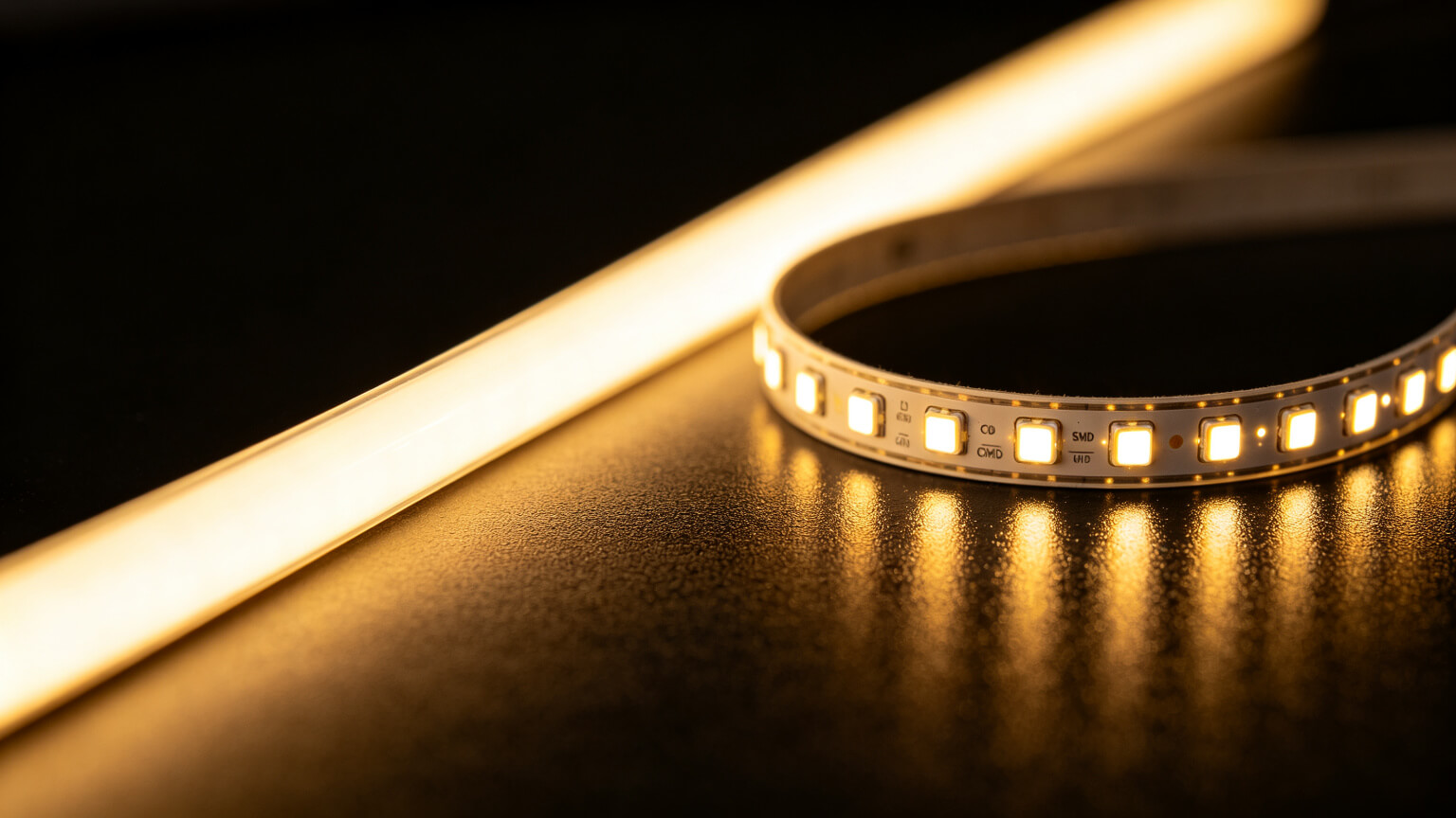
There is a simple visual principle at work: fewer competing colours = clearer hierarchy. In interior design, a room with one accent hue always photographs better than a room with six, because the eye knows where to land. A single colour also reveals the quality of the hardware — when the whole room is one tone, you notice whether the light line is smooth or dotted, whether the colour is consistent along the run, and whether the brightness is balanced.
| Setup style | First impression | After 100 hours of play | Perceived value |
| Rainbow gradient cycling | Impressive in photos | Distracting, feels toy-like | Cheap if LEDs are low quality |
| Single colour, low brightness | Subtle, clean | Calm, easy to ignore | Premium, intentional |
| Single colour + dimming | Professional | Best for long sessions | Highest perceived value |
To stay credible, here is the honest list of situations where RGB genuinely wins:
- Streaming and content: colour shifts behind you add life to an otherwise static background on camera.
- Party or event mode: when the room is a backdrop for people, not for focus.
- Screen-sync effects: if the sync itself is the experience you are showing off.
- Short sessions: if you play under an hour and value the spectacle over comfort.
Outside those cases, a quality single-colour strip does everything a gamer actually needs — and does it better for long sessions. Many RGBIC strips can even be set to a single colour, which gives you both worlds. The colour-by-game breakdown lives in our gaming colour guide.
6. Why Accent Is the Last Priority, Not the First
Here is the counter-intuitive part: the light everyone buys first — the coloured strip — is the third layer. Without ambient, the room is a cave with a glowing stripe. Without task light, you cannot see your keyboard without squinting.
Build in this order and every layer supports the others: ambient gives presence, task gives function, accent gives character. That is also the order that justifies owning more than one strip — each layer earns its place.
| Layer | Job | Brightness target | Typical hardware |
|---|---|---|---|
| Ambient | Fill the room, kill the cave effect | 30–40% of screen white | Ceiling cove, tray lines, wall washes |
| Task | See keyboard and desk clearly | 50–80%, localised | Desk lamp, under-shelf profile |
| Accent | Mood and character | Low, below ambient | Colour strip behind desk or under shelf |
5. The 30–40% Brightness Rule
If your eyes hurt after sessions, or your screen looks washed out, or the room glows like a nightclub even when you are trying to focus — the problem is almost never the lights themselves. It is how bright they are. Ambient lighting should sit at roughly 30–40% of your monitor’s peak white level. Above that, light stops being ambience and starts competing with the screen.
Two related numbers matter. Eye-care guidance says the wall behind the screen should not be more than 3× brighter or darker than the screen, and for bias lighting specifically, ~10% is the right level. The 30–40% figure applies to the room’s ambient and accent glow overall.
| Lighting layer | Target level | What happens above it |
| Bias light behind screen | ~10% of screen white | Glow competes with dark scenes and distracts |
| Room ambient & accent | 30–40% of screen white | Washed-out screen, visual fatigue, headaches |
| Task light (keyboard zone) | Brighter than ambient, never in the eyes | Glare on screen edges and desk reflection |
A two-minute calibration, no instruments needed:
Set a Bright Scene
Open a bright, white-heavy screen — a white web page or the game’s menu.
Dim the Room Light
Lower your ambient strips until the room clearly feels darker than the screen, but not black.
Test in a Dark Scene
Switch to a dark game scene. The glow should be just visible at the edge of your vision.
Lock It In
Save that level on your dimmer or smart control. That is your session preset.
Not all dimming is equal. Cheap controllers dim by rapidly switching the LEDs on and off — pulse-width modulation (PWM) — often at frequencies low enough to produce a flicker you may not consciously see but your eyes still register. Buy a driver rated with high PWM frequency (above ~1kHz) or constant-current dimming, and test at low brightness: move a pen quickly in the light; if you see strobing, the dimmer is flickering.
High-Frequency PWM
Flicker above ~1kHz is imperceptible and safe for long sessions.
Constant-Current Dimming
The premium option — smooth, silent, no strobing at any level.
True 0–100% Range
Many cheap dimmers drop to black at 30% — useless for calibration.
Matched Driver Size
Run drivers at 120–130% of load so dimming stays stable.
Six signs your setup is over-lit:
- Your screen looks washed out — ambient light is competing with peak white.
- You squint or your eyes feel dry after sessions — classic contrast overload.
- The room is the brightest thing you see — ambience should never outshine the display.
- Light reflects off your screen — strips are aimed at the display instead of away from it.
- You run strips at 100% all the time — because the controller does not dim smoothly.
- Headaches after evening sessions — check both brightness and flicker.
The fix is usually one or two changes: a dimmable driver (the cheapest upgrade that changes everything), COB instead of SMD so you need less output for the same smooth glow, and strips aimed at walls and ceilings rather than the display. A full comparison of strip formats lives in our COB vs SMD vs RGBIC guide.
7. A Room Built in Three Layers
Streamers scale this same framework for camera — see gaming room lighting for streamers — and the installation guide shows how to execute it cleanly.
Put it together with a concrete recipe:Ambient Base
A ceiling cove or perimeter run of white strips at 30–40%, dimmed, on a separate switch.
Task Focus
An under-shelf linear profile above the desk, angled away from the screen.
Accent Hue
One colour strip behind the desk and under the desk edge, at low brightness.
Bias Last
A 6500K neutral strip behind the monitor at ~10% — the fourth element that ties it together.
If the monitor is the centrepiece of your room, start with the bias layer — our bias lighting guide shows why it comes first for eye comfort.
8. Frequently Asked Questions
▶How do you light a gaming room properly?
Build three layers in order: ambient light to fill the room (30–40% of screen brightness), task light for the keyboard zone, and a single-colour accent for mood. Add neutral-white bias light behind the monitor last.
▶What is ambient lighting in a gaming setup?
Ambient light is the base layer that fills the room evenly — typically a ceiling cove or wall wash. Its job is to prevent the dark-room contrast that causes eye fatigue.
▶Do I need more than one LED strip for a gaming room?
For a proper setup, yes: one run for ambient, one for task (or a desk lamp), one accent colour, and one neutral-white bias strip. Each layer serves a different function.
▶What colour should accent lighting be?
One deliberate colour — purple is the safest default. Keep accent dimmer than ambient, and never use accent colour behind the screen (that is bias light territory and it should be white).
Plan Your Three-Layer Setup With Us
Send us your room dimensions and we will design the ambient, task and accent layout — with a full parts list, factory-direct pricing and free samples.
Contact KayTai
The layering advice here is the most useful part. Combining ambient, accent and task light gives a room depth that single ceiling lights cannot. The size-based examples help when planning.
Solid overall guide for lighting a gaming room. The layering advice — ambient, accent and task light — is something most beginner guides miss. The examples for different room sizes are a nice touch.
Clear framework for layering ambient, task and accent. I applied the 3-layer approach to a small rental setup and it looks far more intentional than the old single strip under the desk. The dimmer suggestions for accent layers were also helpful.